Brand colours
The colour pallette
Colours are a vital part of our brand and the palette has bold energetic colours as well as quieter, sophisticated colours, allowing for the tone of communications to be dialled up or down depending on our audience and content.
It has been created to meet a high standard of accessibility and by using type and background colours in the correct combinations, we will ensure our content is accessible by a wide audience.
Colour in Action
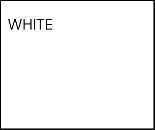
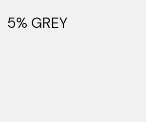
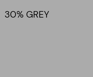
White plays a key role in giving our communications a clean, fresh and professional look, allowing imagery and more colourful elements to stand out when appropriate. Black is used for copy to give maximum legibility. (Black tints at 5% and 30% are also used solely in digital scenarios when we need to isolate content, add contrast and add visual differentiation and legibility to content).

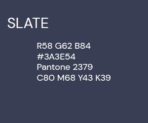
Slate and lime are our key brand colours. Slate is used in backgrounds, website headers, and when an Applied Microbiology International logo or message is featuring on another touchpoint, e.g. our journal websites or the AMI footer in our The Microbiologist website and newsletters. Lime is used for calls to action and when bold stand out is required. Lime is also elevated in our online magazine, The Microbiologist.
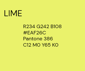
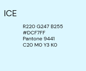
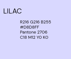
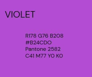
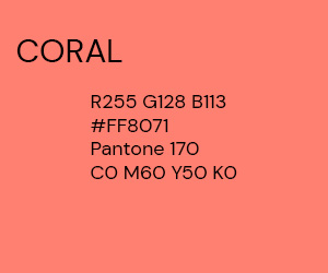
Our accent colours are used in small doses to highlight elements in our backgrounds, magazine or where additional colours are needed on charts and graphs to create impact.
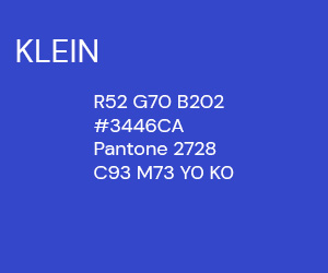
Text should be only used in the colours as shown above (i.e. white text on top of black, slate and klein; for the rest the text should always be black).
To ensure your colour combinations meet the accessibility standard, you can check using this resource: https://color.review